Tailwind
In most of our projects we're using tailwind. It's an easy to understand css framework with its helper classes. If we're setting up a new project and discussing with the designers how to setup the naming conventions and the design system, we're preferring all out tailwind.
Figma and Designers with Tailwind
With the designers we have an agreement that they will adjust their Design systems to Tailwind naming. That means that all the classes in tailwind are 1-1 to the design.
Also, the designers will be using TailwindUI with already finished components to prepare the design.
You can find the TailwindUI auth credentials in our javascript vault in 1Password.
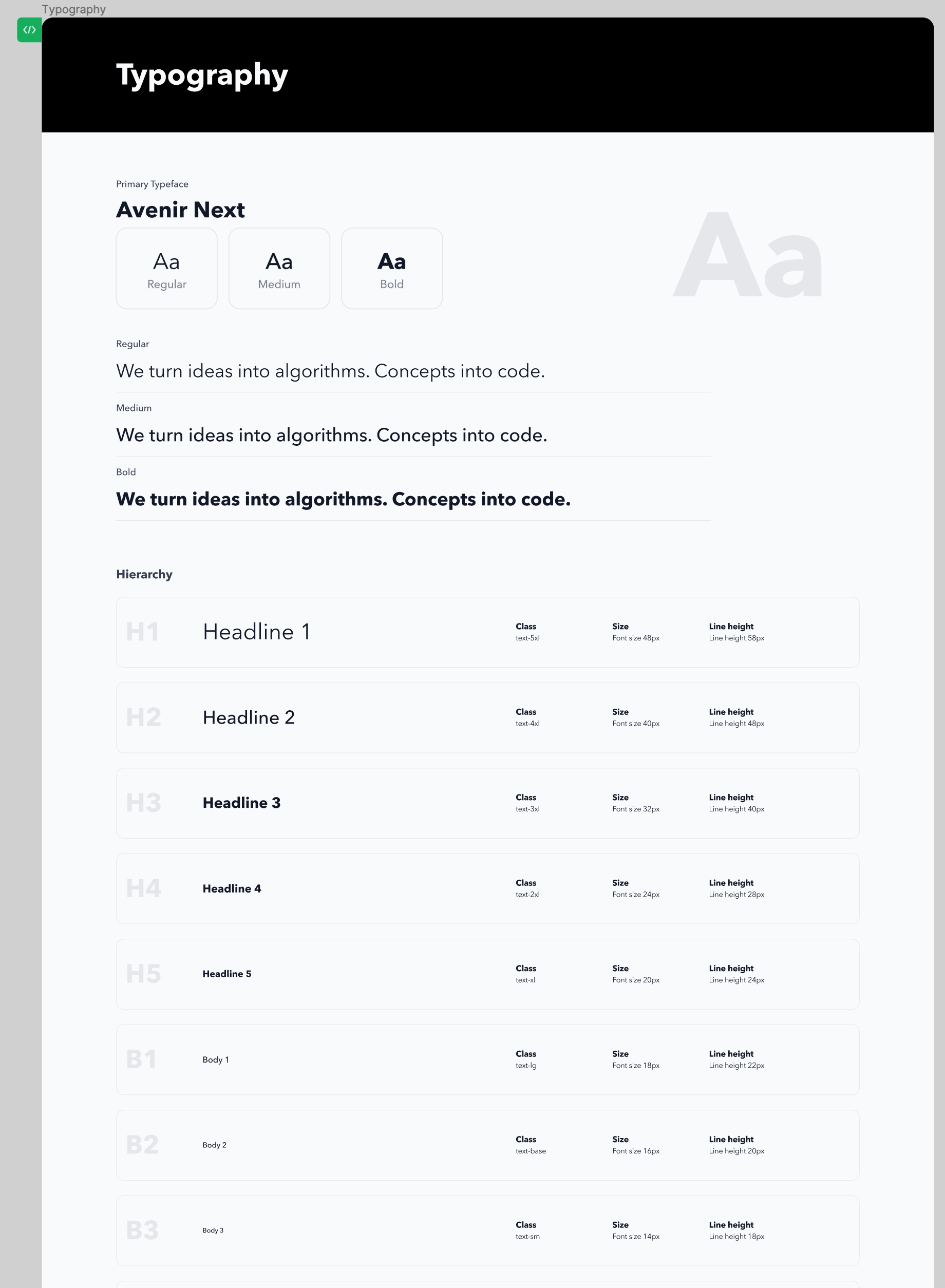
If any of the text styles are going to be changed, as we said before, you can easily use the tailwind classes. It's solely up to the designers on how are they going to change the sizes, spacings, colors.
Usually we'll have a design system prepared to see the changes that were made.
Design system
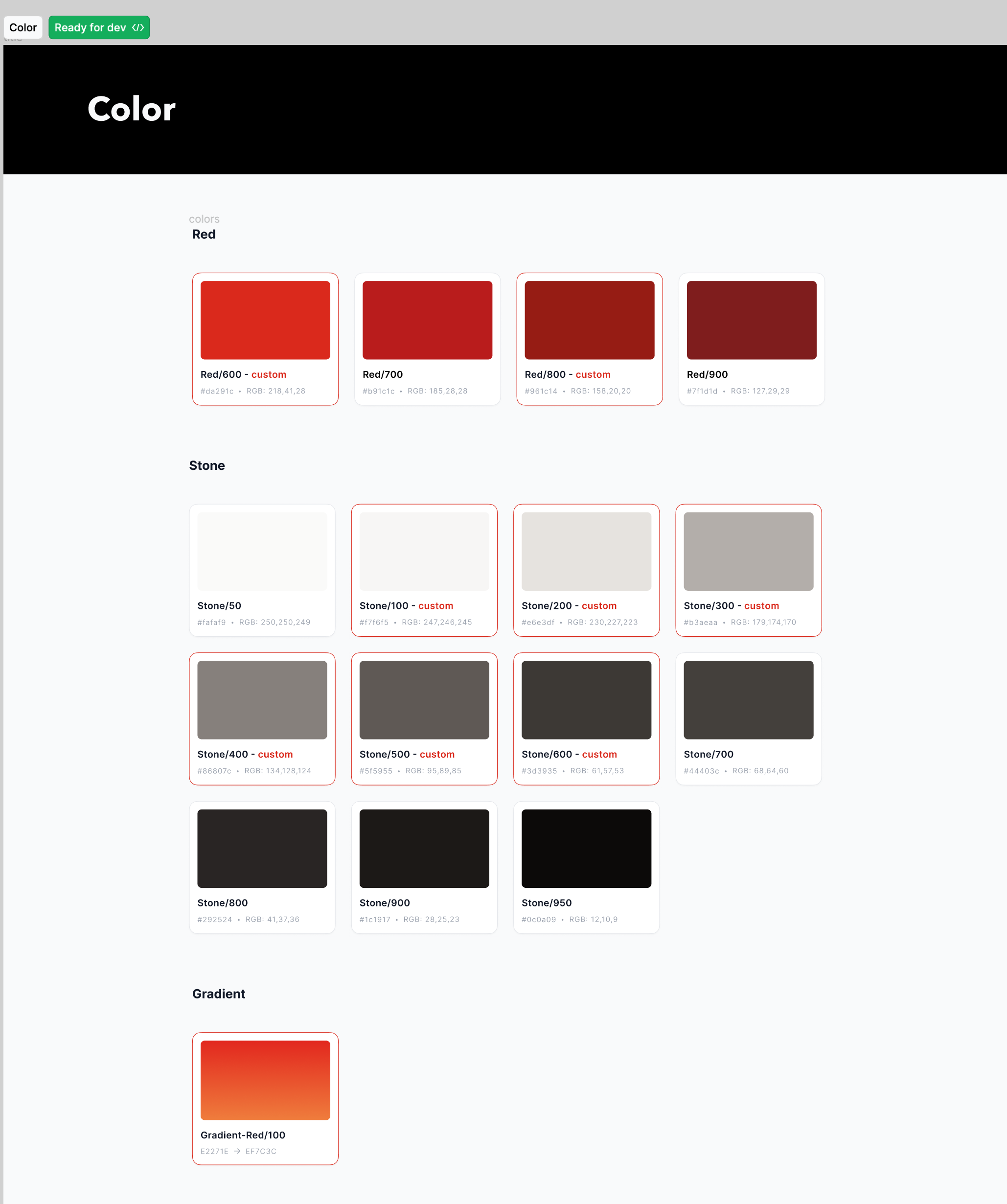
Here is an example of a project where our designers have set up the system with presets for tailwind.
Importing fonts
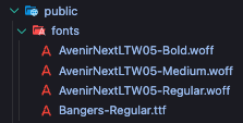
Firstly, we need to add files to our project. Inside root of our project public > fonts we're adding the files for the fonts
provided by the designers.
If the design system is using custom fonts, we're going to import them in the tailwind.config.js file.
import type { Config } from "tailwindcss";

export default {
  content: ["./src/**/*.{js,jsx,ts,tsx}"],
  theme: {
    extend: {
      fontFamily: {
        primary: ["Avenir Next", "sans-serif"],
        bangers: ["Bangers", "sans-serif"],
      },
    },
  },
  plugins: [require("@tailwindcss/forms")],
} satisfies Config;
Custom colors
In our boilerplate template we're using css files to alternate the colors or any other html element or adding any other custom class.
That files are located in src > styles > global.css. Here's an example of how it looks like:
@tailwind base;
@tailwind components;
@tailwind utilities;

:root {
  /* #region  /**=========== Primary Color =========== */
  --tw-color-primary-50: 240 249 255;
  --tw-color-primary-100: 224 242 254;
  --tw-color-primary-200: 186 230 253;
  --tw-color-primary-300: 125 211 252;
  --tw-color-primary-400: 56 189 248;
  --tw-color-primary-500: 14 165 233;
  --tw-color-primary-600: 2 132 199;
  --tw-color-primary-700: 3 105 161;
  --tw-color-primary-800: 7 89 133;
  --tw-color-primary-900: 12 74 110;
  --color-primary-50: rgb(var(--tw-color-primary-50)); /* #f0f9ff */
  --color-primary-100: rgb(var(--tw-color-primary-100)); /* #e0f2fe */
  --color-primary-200: rgb(var(--tw-color-primary-200)); /* #bae6fd */
  --color-primary-300: rgb(var(--tw-color-primary-300)); /* #7dd3fc */
  --color-primary-400: rgb(var(--tw-color-primary-400)); /* #38bdf8 */
  --color-primary-500: rgb(var(--tw-color-primary-500)); /* #0ea5e9 */
  --color-primary-600: rgb(var(--tw-color-primary-600)); /* #0284c7 */
  --color-primary-700: rgb(var(--tw-color-primary-700)); /* #0369a1 */
  --color-primary-800: rgb(var(--tw-color-primary-800)); /* #075985 */
  --color-primary-900: rgb(var(--tw-color-primary-900)); /* #0c4a6e */
  /* #endregion  /**======== Primary Color =========== */
}

@layer base {
  @font-face {
    font-family: "Avenir Next";
    src: url("/fonts/AvenirNextLTW05-Regular.woff") format("woff");
    font-weight: 400;
    font-style: normal;
  }

  @font-face {
    font-family: "Avenir Next";
    src: url("/fonts/AvenirNextLTW05-Medium.woff") format("woff");
    font-weight: 500;
  }

  @font-face {
    font-family: "Avenir Next";
    src: url("/fonts/AvenirNextLTW05-Bold.woff") format("woff");
    font-weight: 700;
    font-style: normal;
  }

  @font-face {
    font-family: "Bangers";
    src: url("/fonts/Bangers-Regular.ttf") format("truetype");
    font-style: bold;
  }

  .cursor-newtab {
    cursor: url("/images/new-tab.png") 10 10, pointer;
  }

  /* #region  /**=========== Typography =========== */
  .h0 {
    @apply font-primary text-3xl font-bold md:text-5xl;
  }

  h1,
  .h1 {
    @apply font-primary text-3xl font-normal md:text-5xl;
  }

  h2,
  .h2 {
    @apply font-primary text-2xl font-medium md:text-4xl;
  }

  h3,
  .h3 {
    @apply font-primary text-xl font-bold md:text-3xl;
  }

  h4,
  .h4 {
    @apply font-primary text-lg font-bold md:text-2xl;
  }

  h5,
  .h5 {
    @apply font-primary text-base font-bold md:text-xl;
  }

  h6,
  .h6 {
    @apply font-primary text-sm font-bold md:text-lg;
  }

  body,
  .p {
    @apply font-primary text-sm md:text-base;
  }

  .font-bangers-5xl {
    @apply font-bangers text-5xl;
  }

  .font-bangers-8xl {
    @apply font-bangers text-8xl;
  }

  /* #endregion  /**======== Typography =========== */

  .layout {
    /* 1100px */
    max-width: 68.75rem;
    @apply mx-auto w-11/12;
  }

  .bg-dark a.custom-link {
    @apply border-gray-200 hover:border-gray-200/0;
  }

  /* Class to adjust with sticky footer */
  .min-h-main {
    @apply min-h-[calc(100vh-56px)];
  }

  html {
    @apply h-full bg-stone-100;
  }
}

@layer utilities {
  .animated-underline {
    background-image: linear-gradient(#33333300, #33333300), linear-gradient(to right, var(--color-primary-400), var(--color-primary-500));
    background-size: 100% 2px, 0 2px;
    background-position: 100% 100%, 0 100%;
    background-repeat: no-repeat;
  }
  @media (prefers-reduced-motion: no-preference) {
    .animated-underline {
      transition: 0.3s ease;
      transition-property: background-size, color, background-color, border-color;
    }
  }
  .animated-underline:hover,
  .animated-underline:focus-visible {
    background-size: 0 2px, 100% 2px;
  }

  .bg-gradient-red-100 {
    @apply bg-gradient-to-b from-[#E2271E] to-[#EF7C3C];
  }
}
As you can see we're using css variables in the global.css to alternate colors. We're then extending the tailwind.config.js to inject the alternated colors in the framework.
import type { Config } from "tailwindcss";

export default {
  content: ["./src/**/*.{js,jsx,ts,tsx}"],
  theme: {
    extend: {
      fontFamily: {
        primary: ["Avenir Next", "sans-serif"],
        bangers: ["Bangers", "sans-serif"],
      },
      colors: {
        red: {
          600: "#da291c",
          800: "#961c14",
        },
        blue: {
          900: "#3d5985",
          950: "#111E34",
        },
        stone: {
          100: "#f7f6f5",
          200: "#e6e3df",
          300: "#b3aeaa",
          400: "#86807c",
          500: "#5f5955",
          600: "#3d3935",
        },
        primary: {
          // Customize it on globals.css :root
          50: "rgb(var(--tw-color-primary-50) / <alpha-value>)",
          100: "rgb(var(--tw-color-primary-100) / <alpha-value>)",
          200: "rgb(var(--tw-color-primary-200) / <alpha-value>)",
          300: "rgb(var(--tw-color-primary-300) / <alpha-value>)",
          400: "rgb(var(--tw-color-primary-400) / <alpha-value>)",
          500: "rgb(var(--tw-color-primary-500) / <alpha-value>)",
          600: "rgb(var(--tw-color-primary-600) / <alpha-value>)",
          700: "rgb(var(--tw-color-primary-700) / <alpha-value>)",
          800: "rgb(var(--tw-color-primary-800) / <alpha-value>)",
          900: "rgb(var(--tw-color-primary-900) / <alpha-value>)",
          950: "rgb(var(--tw-color-primary-950) / <alpha-value>)",
        },
        dark: "#222222",
        alertGreen: "#8FD200",
        alertGreenBg: "#8FD20026",
        errorRed: "#BF0760",
        errorRedBg: "#BF076026",
      },
      keyframes: {
        flicker: {
          "0%, 19.999%, 22%, 62.999%, 64%, 64.999%, 70%, 100%": {
            opacity: "0.99",
            filter:
              "drop-shadow(0 0 1px rgba(252, 211, 77)) drop-shadow(0 0 15px rgba(245, 158, 11)) drop-shadow(0 0 1px rgba(252, 211, 77))",
          },
          "20%, 21.999%, 63%, 63.999%, 65%, 69.999%": {
            opacity: "0.4",
            filter: "none",
          },
        },
        shimmer: {
          "0%": {
            backgroundPosition: "-700px 0",
          },
          "100%": {
            backgroundPosition: "700px 0",
          },
        },
      },
      animation: {
        flicker: "flicker 3s linear infinite",
        shimmer: "shimmer 1.3s linear infinite",
      },
    },
  },
  plugins: [require("@tailwindcss/forms")],
} satisfies Config;
This is the final example of a tailwind config. The primary variable is used for injecting the primary colors that are custom and are not in the
default tailwind color pallette. If the designers want to alternate the default tailwind colors we're also doing it as in the config with the colors variable.
      colors: {
        red: {
          600: "#da291c",
          800: "#961c14",
        },
        blue: {
          900: "#3d5985",
          950: "#111E34",
        },
        stone: {
          100: "#f7f6f5",
          200: "#e6e3df",
          300: "#b3aeaa",
          400: "#86807c",
          500: "#5f5955",
          600: "#3d3935",
        }