Grid
CSS grid is a powerful tool for building complex and responsive layouts. With CSS grid, you can easily create a grid system that allows you to arrange content in columns and rows. But as with any tool, there are best practices that one should follow to ensure that CSS grid is effective and efficient.
Main concepts
- Grid Container - container element in which the grid items are placed
- Grid Item - individual elements that are placed within the grid container
- Grid Lines - horizontal and vertical lines that define the rows and columns of the grid
- Grid Tracks - space between two adjacent grid lines. Rows and columns are made up of grid tracks
- Grid Cell - space between two adjacent row and column grid lines
- Grid Area - rectangular area made up of one or more grid cells
- Grid Template - overall structure of the grid, including the number of rows and columns, the size of the grid tracks, and any gaps between them
- Grid Template Areas - shorthand way to define the layout of the grid by giving names to areas of cells
- Grid Auto Placement - behavior of the grid when placing items that are not explicitly placed
- Grid Alignment - ability to control the positioning of grid items within their cells, including both horizontal and vertical alignment
Why use?
Grid-based layouts
- makes it easy to create complex, grid-based layouts that are flexible and responsive
- you can define the structure of your layout in terms of rows and columns and then place items within those areas
Flexibility
- provides a high degree of flexibility when it comes to designing layout
- you can define the size and position of individual grid items, as well as the size and spacing of grid tracks
Responsive design
- makes it easy to create responsive designs that adapt to different screen sizes and device types.
- by defining the grid template and specifying how items should be placed within the grid, you can create layouts that look great on any device
Simplified code
- creation of complex layouts with relatively little code - this is because the grid layout is defined in a single location, and items are placed within it using a few simple properties
Accessibility
- can improve the accessibility of your website by allowing you to create a logical, tab-able order for your content
- this makes it easier for users who rely on assistive technologies like screen readers to navigate your site
Alignment
- provides a number of powerful tools for aligning grid items within their cells
- this includes both horizontal and vertical alignment, as well as the ability to control the spacing between items
When to use?
-
Multi-column layouts
- it allows you to define the size and position of individual grid items, as well as the size and spacing of grid tracks
-
You have a complex design to implement
- two-dimensional layout system here is perfect to create a complex design. We can use it in our favor to create more complex and maintainable web pages
-
You need to have a gap between block elements:
- we can define the gap between our rows or columns very easily, without having to use the margin property, which can cause some side effects especially if we’re working with many breakpoints
-
You need to overlap elements
- use the
grid-columnandgrid-rowproperties and you can have overlapping elements very easily - with Flexbox we still need to use some hacks such as margins, transforms, or absolute positioning
- use the
-
complex element positioning
- you have to precisely position elements relative to others (both horizontally and vertically), and you need this positioning to easily adapt to various screen sizes
How to create grid layouts?
columns and rows
-
this is the most basic and widely used method for creating CSS grid layouts. You apply the
display: gridproperty to the container element and then define the grid layout using thegrid-template-columnsandgrid-template-rows properties. -
grid-template-columnsandgrid-template-rows properties- defines the columns and rows of the grid with a space-separated list of values. The values represent the track size (length, a percentage, or a fraction), and the space between them represents the grid line. -
example:
.container {
  display: grid;
  grid-template-columns: 1fr 1fr 1fr; /* defines 3 equal-width columns */
  grid-template-rows: auto auto; /* defines auto-sized rows */
}
span
-
you can use the span keyword to specify the number of columns or rows a grid item should span. Adjust the values and grid sizes as needed to fit your specific layout requirements.
-
spanning columns example:
.container {
  display: grid;
  grid-template-columns: 1fr 1fr 1fr;
  grid-template-rows: auto;
}

.item {
  grid-column-start: 1; /* starts at the first column */
  grid-column-end: span 2; /* spans 2 columns */
}
- spanning rows example:
.container {
  display: grid;
  grid-template-columns: 1fr;
  grid-template-rows: 100px 200px 100px;
}

.item {
  grid-row-start: 2; /* starts at the second row */
  grid-row-end: span 2; /* spans 2 rows */
}
- spanning both columns and rows:
.container {
  display: grid;
  grid-template-columns: 1fr 1fr;
  grid-template-rows: 100px 200px 100px;
}

.item {
  grid-column-start: 1; /* starts at the first column */
  grid-column-end: span 2; /* spans 2 columns */
  grid-row-start: 2; /* starts at the second row */
  grid-row-end: span 2; /* spans 2 rows */
}
areas
-
with this method, you can assign names to specific grid cells or areas using the
grid-template-areasproperty. Each grid item can then be placed within the defined areas using thegrid-areaproperty. -
example:
.container {
  display: grid;
  grid-template-columns: 1fr 1fr 1fr;
  grid-template-rows: auto auto;
  grid-template-areas:
    "header header header"
    "main sidebar sidebar"
    "footer footer footer";
}

.item {
  grid-area: header; /* places the item in the 'header' area */
}
line-based placement
- instead of defining explicit grid areas, you can use line-based placement to position grid items on specific grid lines using the
grid-column-start,grid-column-end,grid-row-start, andgrid-row-endproperties.
example:
.item {
  grid-column-start: 1; /* starts at the first vertical grid line */
  grid-column-end: 4; /* ends at the fourth vertical grid line */
  grid-row-start: 1; /* starts at the first horizontal grid line */
  grid-row-end: 3; /* ends at the third horizontal grid line */
}
auto-placement
- by default, grid items are automatically placed in the grid in the order they appear in the HTML markup. However, you can control the placement using the
grid-auto-flowproperty. For example,grid-auto-flow: column;would place items in a vertical column instead of rows.
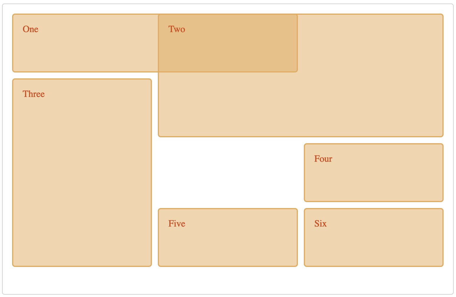
general example
<div class="wrapper">
  <div class="one">One</div>
  <div class="two">Two</div>
  <div class="three">Three</div>
  <div class="four">Four</div>
  <div class="five">Five</div>
  <div class="six">Six</div>
</div>
.wrapper {
  display: grid;
  grid-template-columns: repeat(3, 1fr);
  gap: 10px;
  grid-auto-rows: minmax(100px, auto);
}
.one {
  grid-column: 1 / 3;
  grid-row: 1;
}
.two {
  grid-column: 2 / 4;
  grid-row: 1 / 3;
}
.three {
  grid-column: 1;
  grid-row: 2 / 5;
}
.four {
  grid-column: 3;
  grid-row: 3;
}
.five {
  grid-column: 2;
  grid-row: 4;
}
.six {
  grid-column: 3;
  grid-row: 4;
}
Suggestions & tips
-
Plan your layout before you start coding
- This will help visualize the layout and identify any potential issues before coding starts.
-
Understand the CSS grid syntax and terminology
- this will help writing cleaner and more efficient CSS
- see Learn section for more learning materials
-
Use CSS grid for complex layouts
- CSS grid is particularly useful for building complex layouts, especially those with multiple columns and rows
- it can save time and effort by automating layout tasks.
- if your layout is one-dimensional - it's a better idea to use
flexinstead
-
Use the
frunit for flexible grid tracks- the
frunit is a powerful tool for defining flexible grid tracks that adjust based on available space - it allows you to create a responsive layout that works well on all devices.
- the
-
Use the
repeat()function for consistent and flexible grid patterns- the
repeat()function is a powerful tool for creating consistent and flexible grid patterns - it allows you to specify the number of times a track should be repeated and the size of each track
- the
grid-template-columns: repeat(3, 1fr);
-
Use the
minmax()function for item sizingminmax()function is a useful tool for defining a range of acceptable sizes for grid items- it ensures that the items are sized appropriately and that the layout is consistent
-
When possible, try to leverage the power of CSS Grid to make responsive layouts with no media queries
--min-size: 16rem;

.auto-grid {
  display: grid;
  grid-template-columns: repeat(auto-fill, minmax(var(--min-size), 1fr));
  grid-gap: 1rem;
}
auto-fill: fill as many possible columns as possible in a row, even if they are emptyauto-fit: fit whatever columns there are into the space. Prefer expanding columns to fill space rather than empty columns
-
Use named grid lines for easier layout management
- using named grid lines can make it easier to manage your layout, especially when you have a large number of grid lines
- you can name the grid lines and refer to them by name in your CSS code
.container {
  display: grid;
  grid-template-columns:
    [main-start aside-start] 1fr
    [aside-end content-start] 2fr
    [content-end main-end]; /* two column layout */
}

.sidebar {
  grid-column: aside-start / aside-end; /* placed between line 1 and 2*/
}

footer {
  grid-column: main-start / main-end; /* right across the layout from line 1 to line 3 */
}
-
Use
grid-template-areasto create visual hierarchies- by grouping related items together and assigning them to a named grid area, you can make your layout more readable and easier to understand.
.container {
  display: grid;
  grid-template-columns: repeat(4, 1fr);
  grid-template-areas:
    "header header header header"
    "sidebar content content content"
    "sidebar footer footer footer";
}
-
Avoid using floats and positioning for layout purposes
- when using CSS grid, you should avoid using floats and positioning (for example
position: absolute) for layout purposes as they can cause issues with responsive design and those elements can then break out of grid
- when using CSS grid, you should avoid using floats and positioning (for example
-
Test your layout on different devices and browsers