Flexbox
Flexbox is a one-dimensional layout method for arranging items in rows or columns. Items flex (expand) to fill additional space or shrink to fit into smaller spaces
Why flexbox?
For a long time, the only reliable cross-browser compatible tools available for creating CSS layouts were features like floats and positioning. These work, but they are very limiting and frustrating to work with.
Flexbox is trying to solve following layout difficulties:
- vertically centering a block of content inside its parent
- making all the children of a container take up an equal amount of the available width/height, regardless of how much width/height is available
- making all columns in a multiple-column layout adopt the same height even if they contain a different amount of content
- ...
Its purpose is to simplify many layout tasks, making them easier to work with.
Main concepts
There are three main components of flexbox:
- flex container — flex items are contained inside a flex container
- flex items — elements whose behavior is being controlled
- direction of flow — controls the direction of flex items
The key to understanding Flexbox is to understand the concept of primary axis. The primary axis is the one set by your flex-direction property. With flex-direction: row (default), the primary axis runs horizontally, from left to right. With flex-direction: column, the primary axis runs vertically, from top to bottom.
When to use?
- aligning items: provides powerful alignment tools for both horizontal and vertical alignment, making it easy to align items in a container
- centering items: easy to do centering with
justify-content: centerandalign-items: center - dynamic content: if you have content that can change in size or shape because flexbox allows you to easily adjust the size and position of items based on the content inside them, while CSS Grid works best when you have fixed-size items
- creating flexible layouts: it can easily adapt to different screen sizes and device orientations, making it a great choice for creating responsive designs
- creating grids: can be used to create simple grid-like layouts, such as evenly spaced columns or rows
- ordering content: you can change the order of items in a container, without having to change the HTML markup (example:
flex-direction: row-reverse;) - creating navigation menus: flexbox is often used to create navigation menus, where items are laid out horizontally or vertically and need to be centered or evenly spaced
- creating responsive layouts: toggle between horizontally and vertically stacked content inside of a flexible container, based on screen width
- creating flexible content containers: create containers that can stretch or shrink to fit their content, making it a great choice for content-heavy websites, without having to manually set widths and heights
- creating sticky footers: Flexbox can be used to create a sticky footer that stays at the bottom of the screen, regardless of how much content is on the page.
Learn
Examples
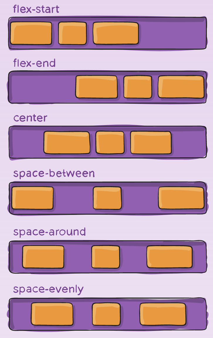
justify-content
justify-content property is used to align the items on the main axis, the direction in which flex-direction has set the flow. Default value is flex-start which will line the items up at the start edge of the container, but you could also set the value to flex-end to line them up at the end, or center to line them up in the center.
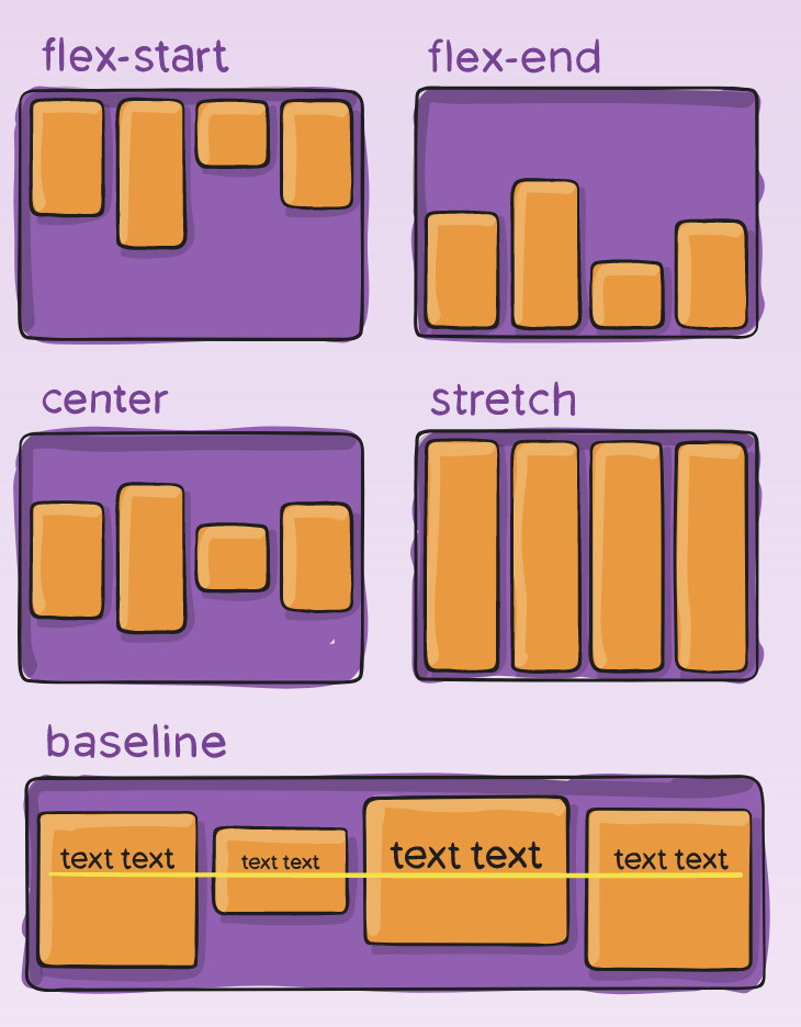
align-items
align-items property will align the items on the cross axis.
The initial value for this property is stretch and this is why flex items stretch to the height of the flex container by default. This might be dictated by the height of the tallest item in the container, or by a size set on the flex container itself. Default value is stretch.
flex-wrap
By default, flex items will all try to fit onto one line. You can change that and allow the items to wrap as needed with this property.
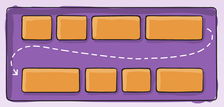
nowrap(default): all flex items will be on one linewrap: flex items will wrap onto multiple lines, from top to bottomwrap-reverse: flex items will wrap onto multiple lines from bottom to top
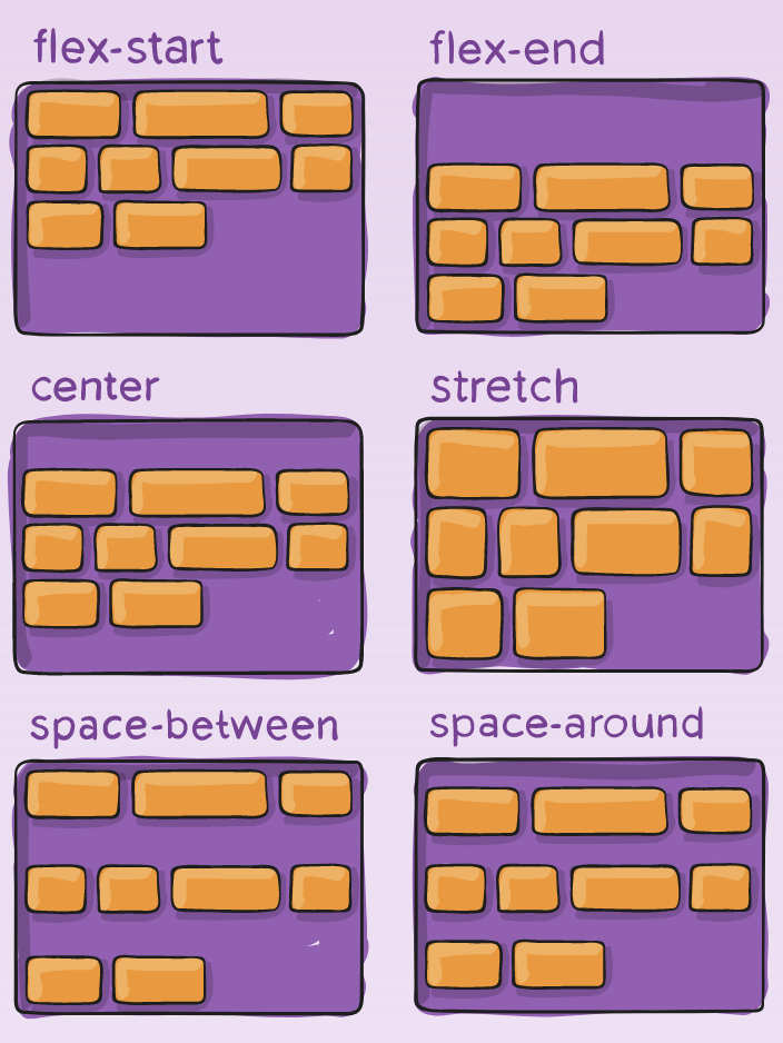
align-content
align-content aligns a flex container’s lines within when there is extra space in the cross-axis, similar to how justify-content aligns individual items within the main-axis.
Note: This property only takes effect on multi-line flexible containers, where flex-wrap is set to either wrap or wrap-reverse. A single-line flexible container (i.e. where flex-wrap is set to its default value, no-wrap) will not reflect align-content.
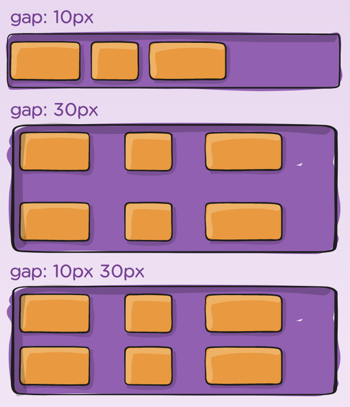
gap
gap property explicitly controls the space between flex items. It applies that spacing only between items not on the outer edges.
The behavior could be thought of as a minimum gutter, as if the gutter is bigger somehow (because of something like justify-content: space-between;) then the gap will only take effect if that space would end up smaller.
It is not exclusively for flexbox, gap works in grid and multi-column layout as well.
Guides and tutorials
- basic concepts of flexbox
- mozilla guide
- web.dev
- CSS tricks flexbox guide
- interactive guide to Flexbox
- Test flexbox skills
Cheatsheets
- flexbox visual examples (you can click and copy code from here)
- interactive Flexbox cheatsheet
- flexbox generator #1
- flexbox generator #2
- flexbox generator #3